Ajatix Image / Banner Slider - Expression Web Add-In
 This
Banner/Image Slider Expression Web add-in will let you add an eye-catching CSS /
JavaScript banner Slider to your website pages without any hand
coding. The program is meant to create a rotating banner image gallery where each
image links to a particular web page (html, php, or asp) rather than a larger image.
The images need to be the same size to start with so you need to go with either
horizontal of vertical images and not a mixture.
This
Banner/Image Slider Expression Web add-in will let you add an eye-catching CSS /
JavaScript banner Slider to your website pages without any hand
coding. The program is meant to create a rotating banner image gallery where each
image links to a particular web page (html, php, or asp) rather than a larger image.
The images need to be the same size to start with so you need to go with either
horizontal of vertical images and not a mixture.
"Chinese proverb. One picture is worth ten thousand words." Perhaps, a slideshow is worth a million.
System requirements and Cost
- Microsoft Windows 10, 8, 7, Vista, XP, 2000
- Microsoft Expression Web 4, 3(SP2), 2, 1.
- Microsoft FrontPage 2003, 2002, 2000
Price: $49.95
Product Website to download trial or purchase.
Buy Now: Banner/Image Slider Addin for Expression Web
Download Trial: Image / Banner Slider 4 - Expression Web Add-In
Buy Now: You can also purchase the Complete Pack of Expression Web Add-Ins which includes all Expression Web add-ins: Advanced CSS Drop Down Menu 5, Lightbox 4, Image / Banner Slider 4, Maps & Directions 2, and Email Spam Blocker 2.
Installing Ajatix Image / Banner Slider
Expression Web Add-ins are easy to install. You can find detailed instructions for Installing Expression Web 4 Add-ins. Installing the Image / Banner Slider Add-in to version 4 made it available for all versions of Expression Web and FrontPage 2003 on my computer. This Expression Web add-in will let you add a great-looking eye-catching CSS / JavaScript banner Slider to your pages without having to write a single line of code.
How to use the Image / Banner Slider Add-in
The instructions and screenshots were taken using Expression Web 4 installed on a Windows 10 computer using version 4.0.4.0. Click any thumbnail to view a larger image.
Step 1: Open the page and place the cursor where you want the insert the Image Slider. Choose Insert from the menu and select Ajatix, then Image/Banner Slider. If this is a new project, select 'New from preset theme.'
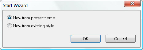
Fig 1: Start Wizard
Step 2: You will see a selection of preset themes. Select the one that best suits your project. Image/Banner Slider is fully customizable. You will be able to change the style, or apply a different theme any time later. You can see a preview of what the Image Slider will look like. I selected 'Travel.' Click the Apply button.
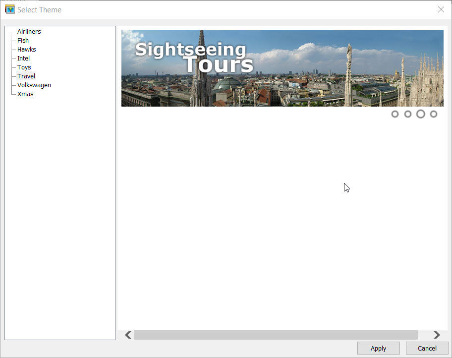
Fig 2: Select Theme
Step 3: Your Image/Banner Slider can be used to display a group
of images (banners). Add images to the Slider by clicking the Add icon
 .
Select the source image (Image Link) and, optionally, a caption and a link for each
entry. Continue adding images till you have all that you want in the Gallery. Do
NOT click the OK button until you have finished adding your images.
.
Select the source image (Image Link) and, optionally, a caption and a link for each
entry. Continue adding images till you have all that you want in the Gallery. Do
NOT click the OK button until you have finished adding your images.
NOTE: The newest version adds a Rich Caption field. Rich Captions offers an optional alternative for the Caption allowing for using HTML markup
IMPORTANT NOTE: You should edit your images BEFORE you start the project so they are the size you choose to display them as. Your images also need to be the same size and rotation (horizontal or vertical) but not mixed.
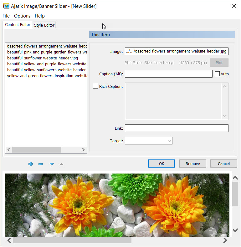
Fig 3: New Image/Banner
Slider - Add images
Step 4: Customize your Slider design by changing size, animation type, colors, navigation bar, caption styles in the Style Editor. When you have finished adding images and styling the Slider, click OK.
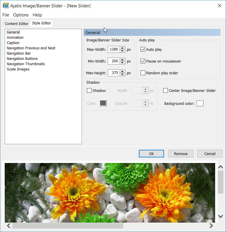
Fig 4: New Image/Banner
Slider - Style Editor
Step 5: You will be prompted to save the css file. Select the location and the name of the CSS file and click the Save button. I save the css file to the same folder where my other style sheets for a particular web are.
You can also save the Slider style into a CSS file by selecting the Save Style command from the File menu. The saved CSS file can be re-used by other Image Banner Slider on the same or different pages.
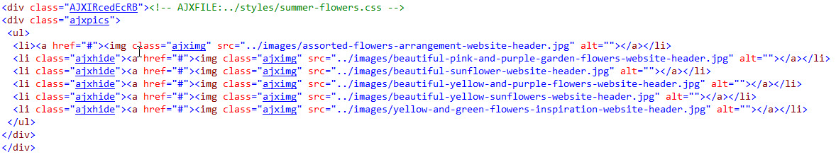
Step 6: The add-in will insert the Slider markup into the page.
Fig 5: HTML Markup inserted
Step 7: Preview the finished page in your browser. Validate your page. The Slider add-in creates Valid HTML and CSS - Slider markup complies with HTML, XHTML and CSS standards and passes W3C and Expression Web validity checks.
Example Slide Show created with an earlier version of the Banner / Image Slider: Travel Journals
Sample Banner/Image Slider (styled to match the site design: Travel Journals)
Example of the add-on used to create a rotating banner slideshow: Blackbird Designs
There is also an extensive Help menu available from within Banner/Image Slider.
Editing Banner/Image Slider Content
The 'Content Editor' tab is where you can add more images to the Slider, re-arrange them, and edit captions. Use Add New Item, Remove Item, Move Item... buttons under the list of images to add new images to the gallery, to remove them, and to rearrange them. See Figure 3.
Editing Banner/Image Slider Style
The 'Style Editor' tab is where you can customize the style of your Slider. There are 6 categories available under this tab. I choose the default option for most of the selections for the example banner Slider I created.
- General tab choices:
Screenshot
- Image Size determines the size with which the images will be displayed. Hint: It is recommended that all the images used in the Image Banner Slider are of the same size and the Image
- Max-Width specifies the maximum width of the slider
- Min-Width specifies the minimum width of the slider
- Max-Height specifies the maximum height of the slider
- Auto play set to automatically play the slider.
- Pause on mouseover set to stop playing when the mouse is over the slider.
- Random play order set to display images in random order.
- Shadow sets CSS3 shadow around the slider.
- Center Image/Banner Slider set to center the slider on the page.
- Background color sets the color of the slider's background. The background can be seen when the navigation bar position is set to Above or Below.
- Size is set in accordance with the actual size of the images.
- Width specifies the width of the images
- Height specifies the height of the images
- Background color specifies the color of the Banner Slider's background. The background can be seen when the navigation bar position is set to Top or Bottom.
- Animation tab choices:
Screenshot
- Animation specifies the type of animation. The options are Slide, Fade, Curtain, Zipper, Wave, Matrix, Fireworks, Puzzle, Mosaic, Ken Burns, and Random options available. NOTE: I selected the Ken Burns effect for this tutorial.
- Direction specifies the direction of animation for the Scroll effect.
- Speed specifies the speed of the animation. You can select between Slow, Normal, and Fast options. The default was normal and I left it like that.
- Delay specifies the time delay before displaying the next image. I left the default selection of 3 seconds.
- Slices In Fade, Curtain, Zipper, Wave, Matrix, Fireworks, Puzzle, and Mosaic animations the images appear as sliced into pieces during transactions. These animations have some additional options available.
- Width sets the width of a slice. The height of a slice equals to the image height or to the slice width.
- Wave turns on a delay in animation of separate slices, causing a wave-like effect, and specifies the direction of the wave propagation.
- Show type determines the way the slices are revealed. Can be set to Slide or Roll.
- Direction specifies the direction in which the slices are moving. The possible options are Left and Right for Curtain animation, Up and Down for Wave animation. This setting is not available for Zipper animation.
- Crossfade adds a crossfade effect to the animation.
- Alternate directions when set, the animation's direction will reverse every other image.
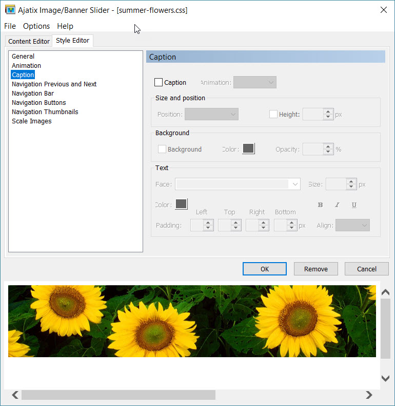
- Caption tab choices:
Screenshot
- Caption turns caption on and off.
- Animation specifies the type of caption animation. There are Slide and Fade options available.
- Position specifies caption position. Available options are Top, Right, Bottom, and Left.
- Height determines the height of the caption area if position is Top or Bottom.
- Width determines the width of the caption area if position is Right or Left.
- Background turns on and off the caption's background.
- (Background) Color sets the color of the caption's background.
- Opacity sets the opacity of the caption's background.
- Face specifies the font face.
- Size defines the font size in pixels.
- Bold, Italic, Underline specifies text weight, style, and decoration.
- (Text) Color sets the text color.
- Padding specifies paddings around the caption's text.
- Align determines horizontal alignment of the caption. Available options are Left, Center, and Right.
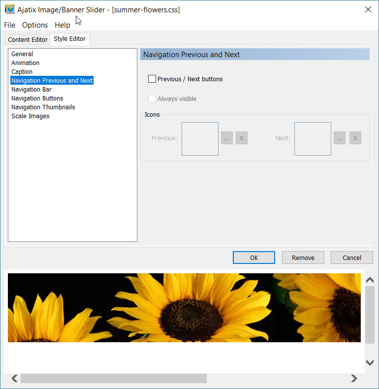
- Editing Previous and Next Buttons Style
Screenshot
- Previous / Next buttons turns the Previous and the Next buttons on and off.
- Icons Images for the Previous and the Next buttons.
- Always visible the buttons "Previous" and "Next" will be visible always.
- Navigation bar is a container with navigation buttons.
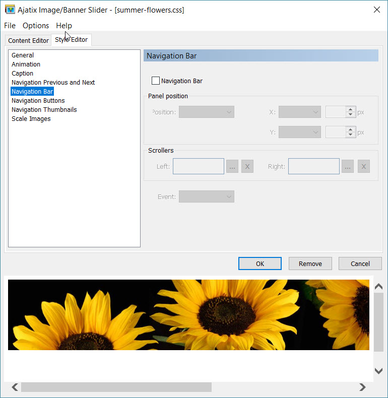
Navigation Bar tab choices:
Screenshot
- Navigation Bar ticking or not ticking this box turns navigation bar on and off.
- Position Specifies the position of the navigation bar. There are Absolute, Above, and Below options available. If set to Absolute the navigation bar will be displayed in front of the image. If set to Above or Below the navigation bar will be displayed above or below the image correspondingly. The total height of the slider will be increased by the height of the navigation bar. X Specifies the horizontal position of the navigation bar. Y Specifies the vertical position of the navigation bar. Scrollers If navigation buttons or thumbnails do not fit into the banner's width, scroller images will appear on the left and on the right of the button strip, allowing to scroll the buttons. Event Specifies the type of event on a navigation button that triggers a switch to the corresponding image / banner. There are Mouseover and Click options available. Swipe gestures are supported on touch devices.
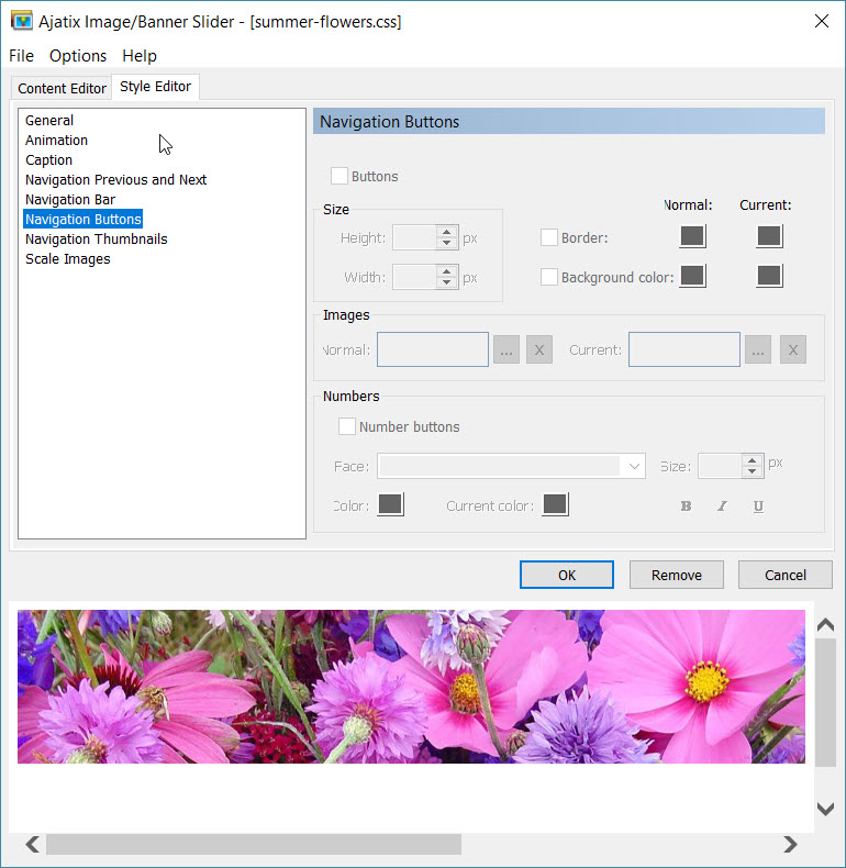
- Navigation Buttons tab choices:
Screenshot
- Buttons Turns navigation buttons on and off. Height Specifies the height of the buttons. Width Specifies the width of the buttons. Border Turns buttons border on and off. Background color Turns buttons background on and off. Images Allows to use images for the navigation buttons. Number buttons When set, the buttons will display numbers of the images inside them. Face Specifies the font face. Size Defines the font size in pixels. Bold, Italic, Underline Specifies text weight, style, and decoration. (Text) Color Sets the text color. Normal and Current colors and background images Different sets of colors and background images can be defined for the normal and for the current states of buttons. Colors and background images of a button will switch to the current values when the mouse is over it or when the image associated with the button is being displayed, and back to normal when another image is displayed.
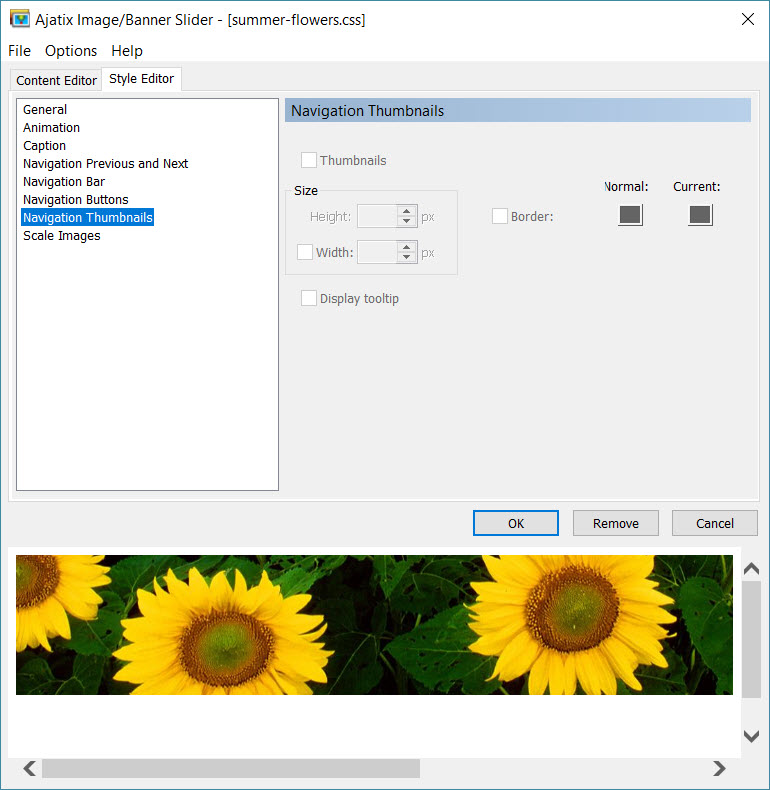
- Thumbnails Style
Screenshot
- Thumbnnails Turns thumbnails on and off. Height Specifies the height of the thumbnails. Width Specifies the width of the thumbnails. If not explicitly set, the width is automatically calculated proportionally to the thumbnail's height. Border Turns thumbnails border on and off. Display title Turns thumbnails title on and off.
- Image Scaling Settings
Screenshot
- The add-in will automatically resize an image if the size of the image does not correspond to the size of the slider. The resized version of the image will be saved next to the original one with the '_banner' suffix added to its file name. Method Select the method of images scaling. Shrink to Fit Images are scaled to fit the slider dimensions without being cropped. Margins are filled with the selected color. Crop to Fit This option crops your images to match the image/banner slider dimensions. Your images will be cropped to ensure that the entire space is filled.
- Background color The color selected is used to fill in the margins when Shrink to Fit scaling method is selected.
Summary
I found this add-in very easy to use and would recommend it as an easy way to add the banner Slider feature to a website or a slidshow. For beginners, no JavaScript or CSS knowledge is required. The HTML markup, CSS, and JavaScript are generated automatically. And it worked well with my dynamic web template.
The Banner/Image Slider works in works in all currently used browsers (such as Chrome, Firefox, Edge, IE8 - IE11, Safari, Opera, etc.), degrades gracefully in very old browsers.
Product Website to download trial or purchase.
Buy Now: Banner/Image Slider Addin for Expression Web
Download Trial: Image / Banner Slider 4 - Expression Web Add-In
Summer Flowers Template
The Banner/Image Slider can also be used to create a masthead of rotating images for your site. The images again need to be the same size and orientation. If you would like to see an example of how they might be used, check out the Summer Flowers Template.

Copyright © 2011-2016 Pat Geary of
Expression Web Tutorials & Templates All Rights Reserved
Tutorial Added June 10, 2011
Updated July 2011
Rewritten September 2016
Expression Web 4.0 Tutorials 2nd Edition from Install to Publish, a FREE EBook by Pat Geary.

Expression Web has a group on Facebook. If you are a FB user, come join us.

Disclosure: This is an affiliate link, which means that if you visit Bluehost.com through this link and purchase this product, I’ll get a commission.

April 2007 - April 2013