Create a Webpage Layout - Create a Webpage Layout in Expression Web 4.0
Before you proceed with creating your webpage layout, you should have spent some time actually thinking about the content and the design you want to use to present that content.
The content, after all, is what is going to draw viewers to your site. You need to decide on the best way to present that content so your viewers find your site and then stay to check it out.
While you can certainly design your layout on the computer, it might be easier to just use a paper and pencil and draw out a rough layout of how to best present you content.
Your layout will probably include a masthead or banner at the top, perhaps a top navigation menu, a content area that may include multiple columns, and footer at the bottom of the page.
In the past, you may have used tables to achieve this look. Tables created an assortment of boxes that were used to create rows and columns. Now web designers use <div>s to form the boxes and CSS to place those boxes on the page.
For this tutorial, we will be using <div> </div> tags to create the various boxes and style rules to place those boxes as a two column layout with masthead, top navigation bar, left sidebar, main content area, and footer. Each of the boxes or divs will hold the content for your page.
What is a <div> tag?
The <div> tag defines a division or section in a page and makes it easy to manage, style, and manipulate those divisions or sections. Browsers usually place a line break before and after the div element. Use the <div> tag to group block-elements to format them with styles.
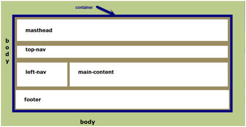
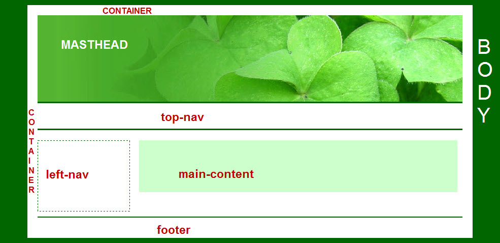
The layout shown above shows the use of div tags. Each div tag <div></div> creates a box. Using various style rules, the boxes will be positioned to create the layout used in this tutorial. Once you learn the basics of working with div’s you can create one, two, or three columned layouts. Read more on the HTML <div> tag.
What are block-level elements?
Create the Layout
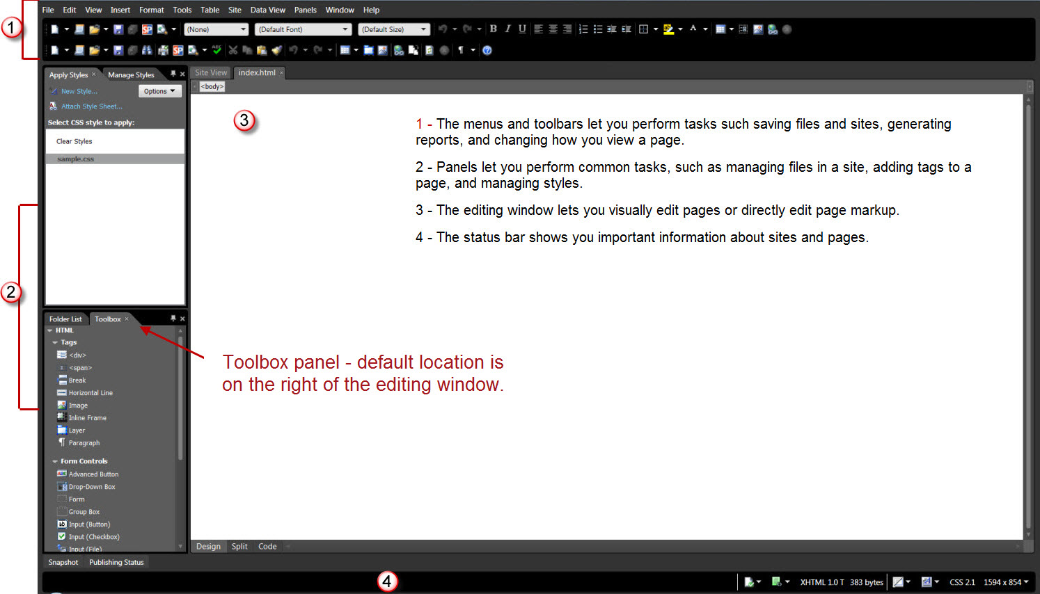
You can work in 'Code View' or 'Design View,' but I would recommend working in 'Split View' so that you see the results of your actions. Before we start, make sure your 'Toolbox panel' is available. Click Panels > Toolbox. The default location is on the right-hand side of your editing window. You can move it wherever you like. View Workspace Screenshot.
As we create the layout for our page, we will also be adding the style rules to our external style sheet. NOTE: When you select 'Preview in Browser,' the last browser you used will be what you see. You should view your pages as you develop them in BOTH Internet Explorer and Firefox and at more than one resolution. Not everyone is going to view you page with their browser open fullscreen or have the latest and greatest in monitors.
Expression Web 3 and 4 offers two additional ways to preview your pages — 'SuperPreview' or the 'Snapshot' panel. To use the 'Snapshot' panel, click Panels > Snapshot. To view your pages with 'SuperPreview,' select File > Display in SuperPreview OR Press Shift + F12.
If it is not already open, open the page you created earlier in Expression Web: File > Open OR Press Ctrl + O.
Style the <body> tag
The body element defines the document's body. To style the <body> tag, create a new style. From the 'Manage Styles' or 'Apply Styles' panel click 'New Style.' In the New Style dialog box, type or select the following:
- Selector: Choose body from the dropdown list.
- Define in: select Existing style sheet from the dropdown. Select the style sheet.
- Font: Set the font-family and color.
- Background: Set your page background color. You may also choose to use a seamless background as the page background.
- Box: Set the margins and padding to 0px, which remove the default margins web browsers apply to a web page.
- Click OK. Save your page and view in your browser.
- At the same time, copy and paste the following to your style sheet: body img { border: 0px; text-decoration: none; }, which will keep any images that are hyperlinks from having the ugly blue border.
Add the Container
The first <div> we will add will be for the container that will "hold" all of the other <div>s or elements of our page. Style rules will be added as we add the <div> tags.
Step 1: With your page open in 'Split View,' drag the <div> from the 'Toolbox' panel and drop it on your open page. You will see that <div></div> has been added to your page.
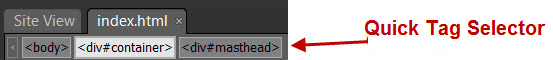
Step 2: Using the 'Quick Tag Selector,' click <div>. From the 'Manage Styles' or 'Apply Styles' panel click 'New Style.' In the New Style dialog box, type or select the following:
View Screenshot of 'Quick Tag Selector'
View Screenshot of 'New Style' Panel
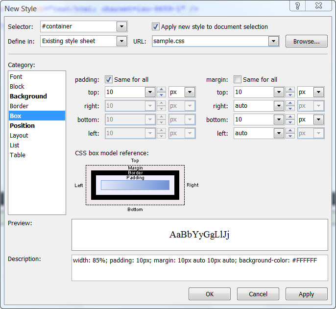
- Selector: #container (the hash mark # is an ID selector)
- Define in: select Existing style sheet from the dropdown.
- Check: Apply new style to document selection.
- URL: Browse to your style sheet that you created and attached in the previous tutorial
- Background: Set the background color #FFFFFF (white). NOTE: Using a light color for the container background will allow your text to be more easily read.
- Click the Position Category in the Style Builder. Set it to 80% for the width. Do NOT specify a height so that the container can expand as you enter content.
- Click on the Box category. Set the right and left margins to 'auto,' and top and bottom to 10px. Set the padding to 10px. NOTE: setting the left and right margins to auto, will center the container on the page.
- Click OK.
Your style sheet now contains the following:
#container { width: 80%; padding: 10px; margin: 10px auto 10px auto; background-color: #FFFFFF; }
and your html code contains
<div id="container"> </div>.
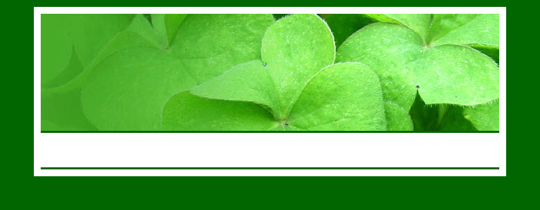
Add the masthead and style rules
- Click and drag a <div> from the Toolbox onto the page, making sure it is INSIDE the container <div>.
- Click 'New Style.' Check: Apply new style to document selection.
- Selector: #masthead
- Click the Position Category: set the height to 170px. Do not set a width. This will allow the header to extend across the entire width of the container.
- Click on the Background Category and set a background color and image if you choose to use one.
- Click OK. Save your page and view in your browser.
Your style sheet now contains the following:
#masthead { background-color: #54B431; background-image: url ('clover-bg.jpg'); background-repeat: no-repeat; background-position: right center; height: 170px; }
and your html code contains
<div id="container">
<div id="masthead"> </div>
</div>
Add the Top Navigation and style rules
- Click and drag a <div> from the Toolbox onto the page making sure it is INSIDE the container <div> and BELOW the masthead <div>.
- Click 'New Style.' Check Apply new style to document selection.
- Selector: #top-nav
- Position: set the height to 50px. Do not set a width. This will allow the menu to extend across the entire width of the container. NOTE: Additional style rules will be added later.
- Border: Set the top and bottom borders.
- Background: Set the background color.
- Click OK. Save your page and view in your browser.
- Menus are best suited to unordered lists. Additional style rules will need to be set for your top navigation.
Your style sheet now contains the following:
#top-nav { height: 50px; border-top: solid medium #006600; border-bottom: solid medium #006600; background-color: #FFFFFF; }
and your html code contains
<div id="container">
<div id="masthead"> </div>
<div id="top-nav"> </div>
</div>
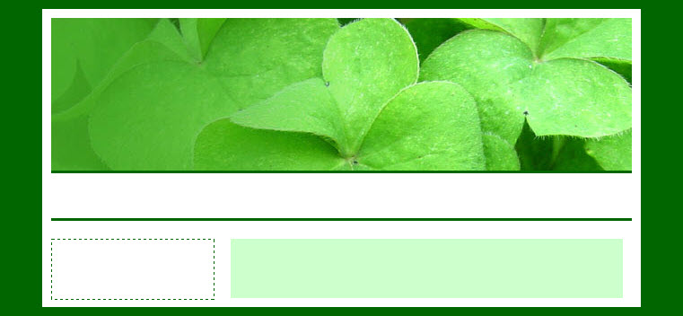
Add and style the Columns
Our sample page will consist of two columns — one on the left for additional navigation or messages and the main column for content. We will float the one column to the left and place the main content area by applying a left margin.
Step 1: Insert the left column
- Click and drag a <div> from the Toolbox onto the page making sure it is INSIDE the container <div> and BELOW the top-nav <div>.
- Click 'New Style.' Check: Apply new style to document selection.
- Selector: #left-nav
- Position: set the width to 180px. Again, do not set a height so the column will expand as you add content.
- Layout: float: left.
- Background: Add a background color or a graphic. If you do not specify the background color, the container will be seen.
- Border: Add a border to this container if you wish.
- Box: Set the top margin at 20px and the bottom margin at 10px. Set the left and right margins as 0px. This will push the top of the left side column down from the border of the top navigation.
- Click OK. Save your page and view in your browser.
- Menus are best suited to unordered lists. Additional style rules will need to be set for your left navigation.
Your style sheet now contains the following:
#left-nav { margin: 20px 0px 10px 0px; width: 180px; float: left; border: thin dashed #006600; }
Step 2: Insert the Right or Main Content Column
- Click and drag a <div> from the Toolbox onto the page, making sure it is INSIDE the container <div> and BELOW the left-nav <div>.
- Click 'New Style.' Check Apply new style to document selection.
- Selector: #main-content
- Background: Add a background color or a graphic. If you do not specify the background color, the color will be the same as specified in the container.
- Border: Add a border to this container if you wish.
- Box: Set the top margin at 20px and the left margin at 200px, right margin to 10px, and bottom margin at 10px. This will push the main content down from the border of the top navigation and to the right of the left navigation <div>.
- Click OK. Save your page and view in your browser.
Your style sheet now contains the following:
#main-content { margin: 20px 10px 10px 200px; background-color: #CCFFCC; }
and your html code contains
<div id="container">
<div id="masthead"> </div>
<div id="top-nav"> </div>
<div id="left-nav"> </div>
<div id="main-content"> </div>
</div>
Add and style the Footer
- Click and drag a <div> from the Toolbox onto the page making sure it is INSIDE the container <div> and BELOW BOTH column <div>s.
- Click 'New Style.' Check Apply new style to document selection.
- Selector: #footer
- Border: Add a top border to this container if you wish.
- Layout: Category: clear: both — this will clear the float that was used to position the column and push the footer below BOTH of the columns.
- Block: text-align: center
- Box: Add padding of 10px to the top and bottom.
- I also add the following style rule to the footer id: #footer p { margin-top: 0px; margin-bottom: 0px;}. This allows for the use of the <p> tag in entering the information for your footer but removes the top and bottom margins of the paragraphs.
- Click OK. Save the page and view in your browser.
Your style sheet now contains the following:
#footer p { margin-top: 0px; margin-bottom: 0px; }
and your html code contains
<div id="container">
<div id="masthead"> </div>
<div id="top-nav"> </div>
<div id="left-nav"> </div>
<div id="main-content"> </div>
<div id="footer"> </div>
</div>
View screenshot of basic layout with <div>'s identified.
Adding Meta Tags
Your page currently contains these meta tags in the head section:
<meta content="text/html; charset=utf-8" http-equiv="Content-Type" >
<title>Sample Site</title>
You will need to add additional meta tags to the head section of your page.
<meta name="keywords" content=" " >
<meta name="description" content=" " >
<meta content="en-us" http-equiv="Content-Language" >
<meta content="General" name="rating" >
<meta content="Copyright © 2008-2009, You Name or Business All Rights Reserved" name="copyright" >
Right click in Design View on your page > Page Properties.
- General Tab
- Title: Type the title for your page.
- Page description: Type a brief description of what your page is about.
- Keywords: Type the keywords for your page.
- Custom Tab (Can be used to add meta tags)
- Click Add >
- Name: Type copyright.
- Value: Type Copyright © 2008-2009, You Name or Business All Rights Reserved.
- Click OK.
OR you can copy and paste the tags into your document. Read more on Basic Meta Tags.
Summary
You have now completed the basic layout of your page. Additional style rules will need to be added for your menus, your heading tags, and floats for your images. You can test how your page layout will look by adding some filler content. Some of the style rules will need to be modified. E.g., adding padding to the main content area and the left navigation container.
NEXT STEP: Adding Navigation to the Layout 
This will be done in two parts. We will add a horizontal top menu, then a left.side navigation menu. You may choose to use one or the other or both.

Copyright © 2009 Pat Geary of Expression Web Tutorials and Templates, All Rights Reserved
Revised May 2012
Expression Web 4.0 Tutorials 2nd Edition from Install to Publish, a FREE EBook by Pat Geary.

Expression Web has a group on Facebook. If you are a FB user, come join us.
Disclosure: This is an affiliate link, which means that if you visit Bluehost.com through this link and purchase this product, I’ll get a commission.

April 2007 - April 2013