Ajatix Lightbox Add-In for Expression Web
What is a "lightbox?" According to Wikipedia:
Lightbox permits users to view larger versions of images without having to leave the current page, and is also able to display simple slideshows. The use of the dark background, which dims the page over which the image has been overlaid, also serves to highlight the image being viewed.
If you Google "lightbox," you will get a long list of them. Some are free, some are not. Ajatix Lightbox is a commercial Add-In for Expression Web 4. This add-in will work with Microsoft Expression Web (all versions) and Microsoft FrontPage 2003, 2002, 2000. You will then see a new menu item on the Insert menu. With EW 4, each Ajatix add-in is a separate menu item. With earlier versions and FrontPage, they are a sub-menu of the Ajatix menu item.
The latest version as of this writing is 2.0.6 which includes the following new features:
- HTML 5 support - complies with the latest HTML and CSS standards.
- Expand - when initially displayed, large images are scaled down to fit the browser window. With a click on the Expand icon you can make them display full size.
- Drag around - move large images around to study them closely when displayed in full size. Drag images to reveal content behind them.
- Control bar - control bar with optional Previous, Next, Play / Pause, Move, Expand, Close buttons.
- Slideshow - automatic rotation of images can be enabled.
- Preload - automatic preloading of the next / previous image in a gallery significantly reduces waiting time.
- Free updates to all coming 2.x.x versions.
System requirements and Cost
- Microsoft Windows 8, 7, Vista, XP, 2000
- Microsoft Expression Web 4, 3(SP2), 2, 1,
- Microsoft FrontPage 2003, 2002, 2000
Price: $49.95
Product Website to download trial or purchase.
Buy Now: Lightbox 4 - Expression Web Add-In
Download Trial: Lightbox 4 - Expression Web Add-In
Buy Now: You can also purchase the Complete Pack of Expression Web Add-Ins which includes all Expression Web add-ins: Advanced CSS Drop Down Menu 5, Lightbox 4, Image / Banner Slider 4, Maps & Directions 2, and Email Spam Blocker 2.
Installing Ajatix Lightbox
Expression Web Add-ins are easy to install. You can find detailed instructions for Installing Expression Web 4 Add-ins. Installing the Lightbox Add-in to version 4 made it available for all versions of Expression Web and FrontPage 2003 on my computer. This Expression Web add-in will let you add a great-looking lightbox to your pages without having to write a single line of code.
How to use the Lightbox Add-in
The instructions and screenshots were taken using Expression Web 4 installed on a Windows Vista computer. Click any thumbnail to view a larger image.
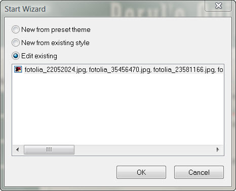
Step 1: Open the page and place the cursor where you want the single image or gallery inserted. Choose Insert from the menu and select Ajatix, then Lightbox. If this is a new gallery, select 'New from preset theme.'
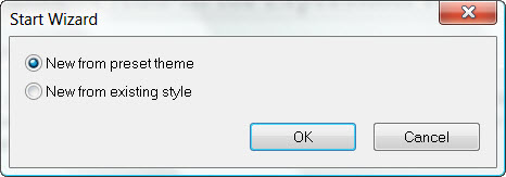
Fig 1: Start Wizard
Step 2:You will see a selection of preset lightbox themes. Select the one that suits your project. Ajatix Lightbox is fully customizable. You will be able to change the style, or apply a different theme any time later. You can see a preview of what the lightbox will look like. I selected 'Frameless.' Click the Apply button.
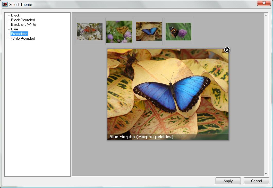
Fig 2: Select Theme
Step 3: Your lightbox can be used to display a single image
or a group of images (gallery). Check the Gallery option to enable
multiple images. Add images to the lightbox by clicking the Add icon
 .
Select the source image (Link) and, optionally, a Caption for each entry. Thumbnails
will be generated automatically. Continue adding images till you have all that you
want in the Gallery. Do NOT click the OK button until you have finished adding your
images.
.
Select the source image (Link) and, optionally, a Caption for each entry. Thumbnails
will be generated automatically. Continue adding images till you have all that you
want in the Gallery. Do NOT click the OK button until you have finished adding your
images.
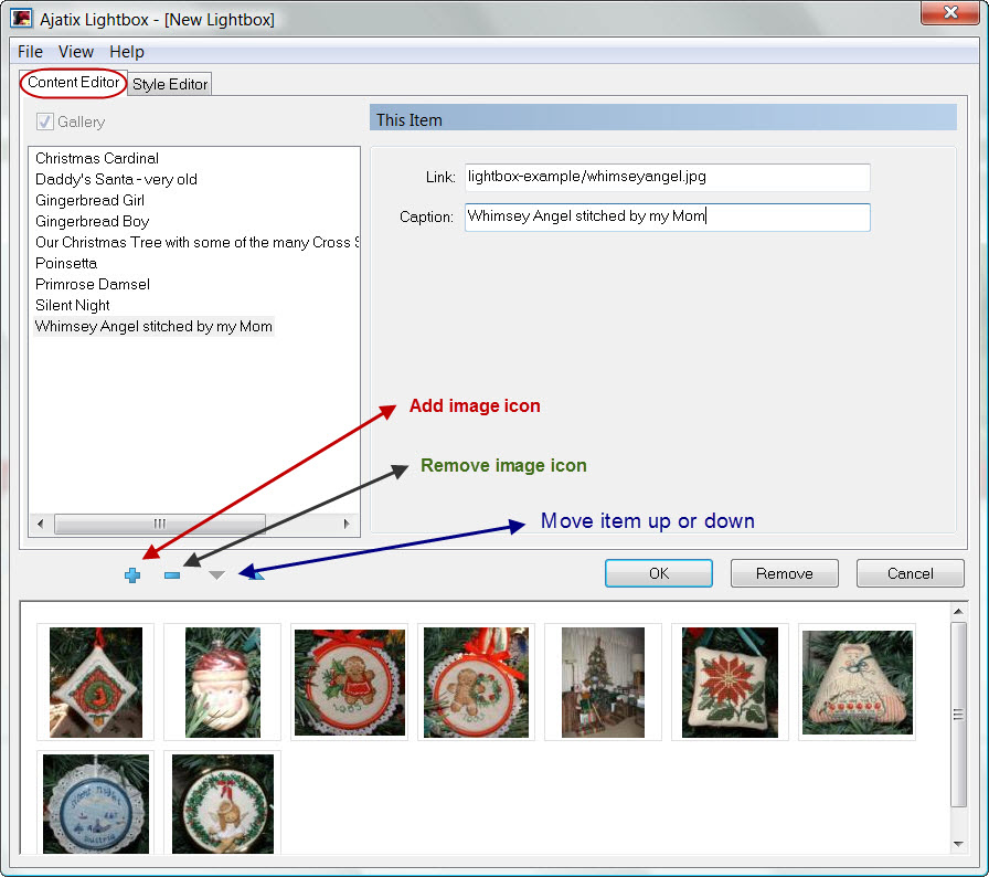
Fig 3: New Lightbox
- Add images
Step 4: Customize your lightbox design by changing colors, navigation images, caption, outline, and thumbnail styles in the Style Editor. When you have finished adding images and styling the lightbox, click OK.
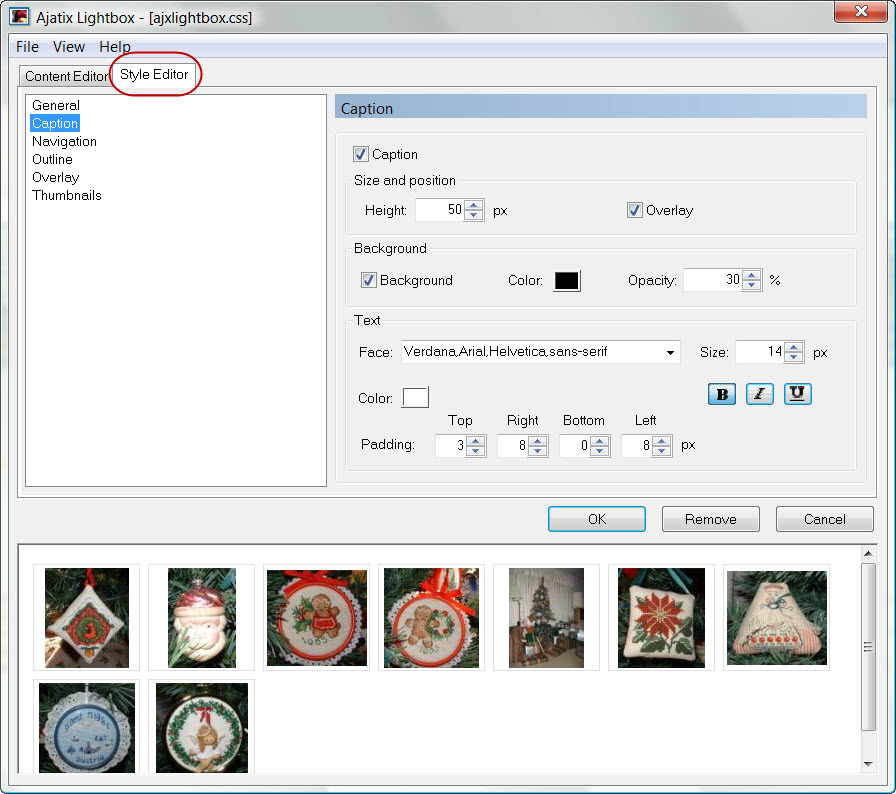
Fig 4: Lightbox style editor
Step 5: You will be prompted to save the css file. Select the location and the name of the CSS file and click the Save button. I save the css file to the same folder where my other style sheets for a particular web are.
Step 6: The add-in will insert the lightbox markup into the page.
Fig 5: HTML Markup inserted
Step 7: Preview the finished page in your browser. Validate your page. The lightbox add-in creates Valid HTML and CSS - lightbox markup complies with HTML, XHTML and CSS standards and passes W3C and Expression Web validity checks.
Sample Gallery: Christmas Counted Cross Stitch
Sample Gallery: Beryl's Quilts which is part of a new Site Template offered Free.
There is also an extensive Help menu available from within Lightbox.
Editing Lightbox Content
The 'Content Editor' tab is where you can add more images to the lightbox, re-arrange them, and edit captions. Use Add New Item, Remove Item, Move Item... buttons under the list of images to add new images to the gallery, to remove them, and to rearrange them. See Figure 3.
To access an existing Lightbox gallery for editing, open th epage your current lightbox is part of. Go to Insert on the menu and select Ajatix > Lightbox. The Start Wizard dialog box should popup with 'Edit existing' already ticked. Click OK and make whatever changes/additions you want. Save and Preview. View Screenshot
Editing Lightbox Style
The 'Style Editor' tab is where you can customize the style of your lightbox. There are 6 categories available under this tab:
- General tab choices:
- Z-index specifies the stack level of the lightbox. A lightbox with higher z-index will appear in front of HTML elements with lower z-index.
- Background color - The color of the lightbox's background.
- 'Loading...' image The 'loading' state image that will be displayed while the lightbox's content is being downloaded.
- Caption tab choices:
- Caption Turns caption on and off.
- Height Determines the height of the caption area.
- Overlay If set, the caption will overlay the image. Otherwise the caption will be shown below the image.
- Background Turns on and off the caption's background.
- (Background) Color Sets the color of the caption's background.
- Opacity Sets the opacity of the caption's background.
- Face Specifies the font face.
- Size Defines the font size in pixels.
- Bold, Italic, Underline Specifies text weight, style, and decoration.
- (Text) Color Sets the text color.
- Padding Specifies paddings around the caption's text.
- Navigation tab choices:
- Theme Allows to select one of the preset navigation themes.
- Previous / Next Images for the Previous and the Next buttons.
- Close button Image for the Close button. The Close button is optional.
- Position The Close button is positioned at the top right corner of the lightbox. You can adjust its offset from the corner by setting Right and Top values.
- Close on content click If set, the lightbox can be closed by clicking on it.
- Close on overlay click If set, the lightbox can be closed by clicking on the overlay outside of it.
- Outline tab choices:
- Outline Turns on and off a frame outline around the lightbox. White or black outline can be selected.
- Rounded corners When selected, corners of the frame outline will be rounded.
- Drop shadow If set, the lightbox will cast a shadow.
- Overlay tab choices:
- Overlay If set, the content of a page behind the lightbox will be dimmed with a dimming overlay.
- Color Sets the overlay's color. Opacity Sets the overlay's opacity.
- Thumbnails tab choices:
- Max Width and Max Height Define maximum width and height of a thumbnail image.
- (Thumbnail image) Border Sets the thumbnail border color for normal and mouseover states.
- Outer Box When set, a box will be drawn around a thumbnail.
- Width and Height Define the outer box size.
- Background Sets the outer box color for normal and mouseover states.
- (Outer Box) Border Sets the outer box border color for normal and mouseover states.
- Margin Defines the size of the margin around a thumbnail.
Summary
I found this add-in very easy to use and would recommend it as an easy way to add the lightbox feature to a website. For beginners, no JavaScript or CSS knowledge is required. The HTML markup, CSS, and JavaScript are generated automatically. And it worked well with my dynamic web template.
The lightbox add-in automatically creates thumbnail images of the required size. Unlike the autothumbnail feature in Expression Web, I did not have to optimize the code to remove the comments.
Large images will be displayed scaled down, so that the lightbox can fit within the browser window.
The lightbox feature works in all currently used browsers (such as IE6, IE7, IE8, Firefox, Opera, Safari, Chrome, etc.), degrades gracefully in very old browsers.
Product Website to download trial or purchase.
Buy Now: Lightbox 4 - Expression Web Add-In
Download Trial: Lightbox 4 - Expression Web Add-In
Buy Now: You can also purchase the Complete Pack of Expression Web Add-Ins which includes all Expression Web add-ins: Advanced CSS Drop Down Menu 5, Lightbox 4, Image / Banner Slider 4, Maps & Directions 2, and Email Spam Blocker 2.

Copyright © 2010-2016 Pat Geary of
Expression Web Tutorials & Templates All Rights Reserved
Tutorial Added July 1, 2010
Links Updated September 2016
Expression Web 4.0 Tutorials 2nd Edition from Install to Publish, a FREE EBook by Pat Geary.

Expression Web has a group on Facebook. If you are a FB user, come join us.

Disclosure: This is an affiliate link, which means that if you visit Bluehost.com through this link and purchase this product, I’ll get a commission.

April 2007 - April 2013