

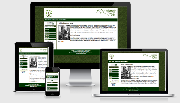
My Family Tree Template


The My Family Tree template is based on one of the mobile friendly layouts available from Migrating from FrontPage to Expression Web. This template uses a fluid width layout.
Images
The equal height column look is achieved by using a background image. If you wish to change the colors of the columns, you will need to create a new image. The border for the right sidebar is part of the image.
The font used to create the Our Family Tree logo is Vivaldi in color #4A6C22.
Menus
The top menu on this template allows for only one level and you need to be careful of the number of menu items you include. If you would like to use a multilevel dropdown, see Horizontal Mobile-Friendly Multi-level Menu. Or you might consider some of the responsive menus from CSS Menu Maker.
You have the ability to use a sectional navigation menu on the right sidebar if you choose.
Miscellaneous
The Google Custom search box will need to be adjusted with the code for YOUR custom search. You can, of course, use any search engine you choose. The styling for the search areas is part of the external style sheet.
CSS and Script Links
Besides the main style sheet (site.css), there is a special style sheet (media-queries) which allows the inclusion of special CSS rules to optimize your page for mobile browsers.
Additional Resources
You can find detailed instructions for working with the mobile friendly site templates as well as a pdf file you can download and print.
Gotcha's
You will need to preview your page within a browser as Design View will NOT display the page as it should look.