Wobbles Template


The Wobbles template uses a triple layered background look with equal height columns. This template uses some CSS3 for the rounded corners and box shadows. The rounded corners will display as intended in newer modern browsers and will degrade gracefully in older browsers and default to rectangular corners. This template uses a fluid width layout with a maximum width set to 1300px. You can increase or decrease the maximum width if you so desire. This template is also mobile friendly.
Images:
 The images used for the background on this page as well as the masthead and footer are from Eos Developments. You will need to retain the credits link if you choose to use any of their images. You can substitute your own images for any of the Eos Development images.
Style classes are included to float your images right or left or center them on the page.
The sitename and tagline use plain text. You can create a transparent graphic image using a fancy font to use for the site name if you so choose.
Changing the Column Background Colors
The equal height column look is achieved by using a background image on the contentWrapper. If you wish to change the color scheme, make sure you create a new image to use for the background.
If you wish to obtain the equal height column look without the use of images, the folks at Project VII have the following tutorial you can use: PVII Equal Height CSS Columns
CSS and Script Links
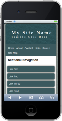
Besides the main style sheet (site.css), there is a special style sheet (media-queries) which allows the inclusion of special CSS rules to optimize your page for mobile browsers.
Screenshot of template viewed in Ipad in portrait orientation.
Additional Resources
You can find detailed instructions for working with the mobile friendly site templates as well as a pdf file you can download and print.
Also resources on both drop shadows and rounded corners.
Gotcha's
You will need to preview your page within a browser as Design View will NOT display the page as it should look.
Depending on the length of your content, you may find it difficult to edit your pages in Design View.
Alternate Color Schemes
The seamless tiles used as the various backgrounds are available in several color combinations.