Triple Layered Background Template


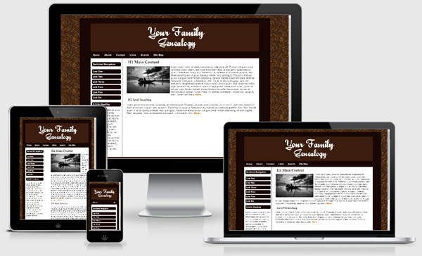
The Triple Layered Background template is based on one of the templates offered on our sister site - Expression Web Mobile Friendly Site Templates. This template uses some CSS3 for the rounded corners and drop shadows. The rounded corners will display as intended in newer modern browsers. They will degrade gracefully in older browsers and default to rectangular corners. This template uses a liquid width with a maximum width of 1300px. The layout and is mobile friendly and passes Google's mobile-friendly test. The download is available as a personal web package which includes a dynamic web template and all supporting files for a small site for use with Expression Web.
Images:
The header graphic image used with this template is inserted directly into the html code with the class scalable applied. This will allow your image to scale to fit all device displays. Class style rules are included to float your images right or left or center them on the page as well as scaling them so they display in all devices. The equal height column look is achieved by using a background image. If you wish to change the colors of the columns, you will need to create a new image. The border for the right/left sidebar is part of the image.
Menus
The top menu on this template allows for only one level only and you need to be careful of the number of menu items you include. If you would like to use a drop-down menu for the top navigation see Dropdown Menu in Navbar. You may also delete the top menu if you choose. A sectional navigation menu is included on the left sidebar.
Search Box
The Google Custom search box will need to be adjusted with the code for YOUR custom search. You can, of course, use any search engine you choose. The styling for the search areas is part of the external style sheet.
CSS and Script Links
Besides the main style sheet (site.css), there is a special style sheet (media-queries) which allows the inclusion of special CSS rules to optimize your page for mobile browsers. There is also a style sheet for the contact form.
Triple Layered Background Styling
The outermost layer is styled using the body tag. The second layer is styled with a background image using #container. The innermost layer is styled using #outerWrapper. You can use an image or color for various layers.
Additional Resources
You can find detailed instructions for working with the mobile friendly site templates as well as a pdf file you can download and print.