


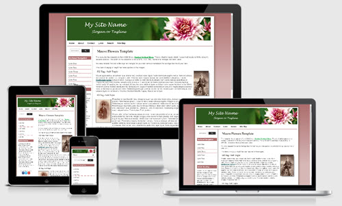
Mauve Flowers Mobile Friendly Template


The Mauve Flowers Template is based on one of the templates offered on our sister site - Expression Web Mobile Friendly Site Templates. This template uses a fluid width layout with a maximun width of 1300px and is mobile friendly.
Package Includes
This template package includes:
- A complete DWT Site Template package which requires FrontPage 2003, any versions of Expression Web or Sharepoint Designer.
Menu
The sidebar menu for this template is from CSS Drive - Dashed Vertical Menu. The top menu is a responsive menu from W3schools.
Images
Classes are included as part of the style sheet to float your images right or left or center them on the page. If you want any images to resize depending on the device size, you MUST apply class="scalable" to the image. The masthead image is 1247px by 200 px. The site name has been added to the image. A blank image is included for you to edit with your site name. Bullet images are included for any lists you might use
Changing the Column Background Color
A background image is used to create the equal height column look. If you wish to change the color of the columns, you will need to create a new image.
Additional Resources
You can find detailed instructions for working with the mobile friendly site templates as well as a pdf file you can download and print.