


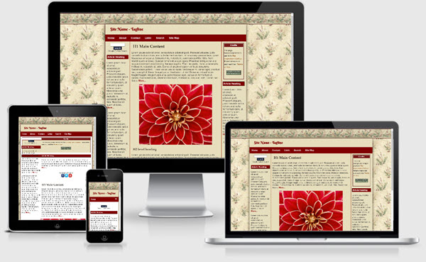
Floral Inspirations Site Template


The Floral Inspirations Site Template package is meant to be an example of something you can do with one of the site templates offered by our sister site Migrating from FrontPage to Expression Web. This particular one is based on the 3 equal columns layout with a fixed width of 1024px. A background image for the contentWrapper achieves this effect.
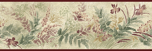
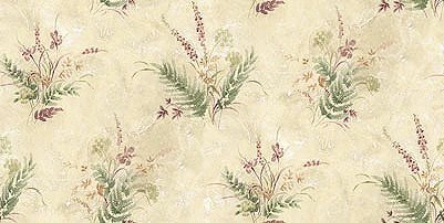
Body Background
The background of a box can have multiple layers in CSS3. The number of layers is determined by the number of comma-separated values in the ‘background-image’ property. Note that a value of ‘none’ still creates a layer. Each of the images is sized, positioned, and tiled according to the corresponding value in the other background properties. The lists are matched up from the first value: excess values at the end are not used. If a property doesn't have enough comma-separated values to match the number of layers, the UA must calculate its used value by repeating the list of values until there are enough. Layering multiple background images
To achieve the body background look, one image, the top border, is included in the body style rule and repeated horizontally. A second <div> tag was added to contain the main page background and is repeated horizontally and vertically. Make sure you also specify a background color for each in case the background image does not load.
Sidebar Content
If you want the sidebars to remain the same from page to page, leave them as they are. If you want all or a portion of them to change from page to page, you will need to make those areas an editable region.
Images
Classes are included to float your images left or right or center them on the page. If you want your images to resize in mobile devices, apply the scalable class.
Changing the Column Background Colors
A background image is used to create the equal height column look. If you wish to change the color of the columns, you will need to create a new image which is 964px wide x 73px high. Both ends are the width of the side columns plus the left and right padding.
Additional Resources
You can find detailed instructions for working with the mobile friendly site templates as well as a pdf file you can download and print.