


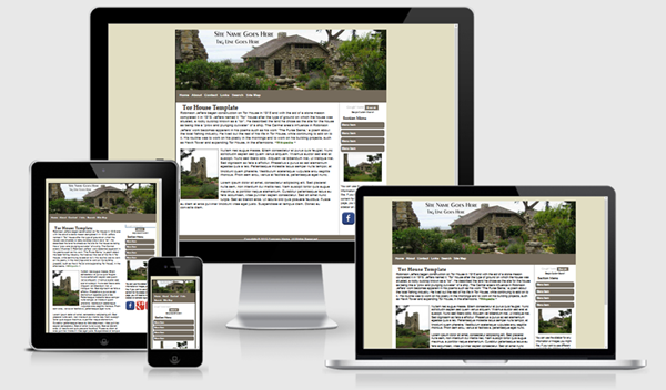
Tor House Template


The Tor House template is based on one of the layouts available from Migrating from FrontPage to Expression Web. The drop shadows will display as intended in newer modern browsers. This template uses a fixed width layout.
The download is available as a personal web package which includes a dynamic web template and all supporting files for a small site for use with Expression Web.
Images:
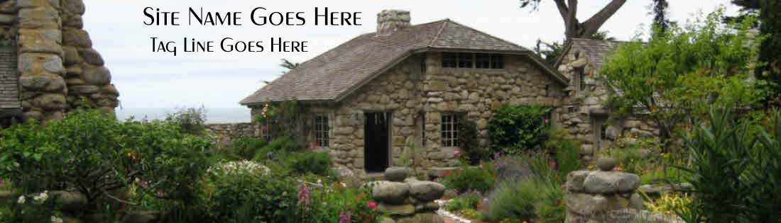
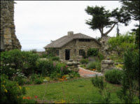
The header graphic image used with this template is from photo by Pat Geary. The photograph was taken at Tor House, Carmel California June 2009. You can substitute your own image for the masthead but you will need to make sure the image is wide enough to fill the space. Class style rules are included to float your images right or left or center them on the page as well as scaling them so they display in all devices. If you want the masthead image to scale to fit all devices, it needs to be inserted into the html code and the class scalable applied.
The equal height column look is achieved by using a background image. If you wish to change the colors of the columns, you will need to create a new image. The border for the right sidebar is part of the image.
Menus
The top menu on this template allows for only one level and you need to be careful of the number of menu items you include.
You have the ability to use a sectional navigation menu on the right sidebar if you choose.
If you would like to use a drop-down menu for the top navigation see Horizontal Mobile-Friendly Multi-level Menu.
Miscellaneous
The Google Custom search box will need to be adjusted with the code for YOUR custom search. You can, of course, use any search engine you choose. The styling for the search areas is part of the external style sheet.
CSS and Script Links
Besides the main style sheet (site.css), there is a special style sheet (media-queries) which allows the inclusion of special CSS rules to optimize your page for mobile browsers.
Additional Resources
You can find detailed instructions for working with the mobile friendly site templates as well as a pdf file you can download and print.
Gotcha's
You will need to preview your page within a browser as Design View will NOT display the page as it should look.