
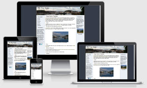
Friday Harbor Template


The Friday Harbor template based on one of the templates offered on our sister site - Expression Web Mobile Friendly Site Templates. This template uses some CSS3 for the rounded corners which will display as intended in newer modern browsers. They will degrade gracefully in older browsers and default to rectangular corners. This template uses a fixed width layout and is mobile friendly.
This package also includes a blank template that can be used with any web editor.
Images
Classes are included to float your images left or right or center them on the page. The anchor image used as the menu bullet is from Icons etc. It has been resized much smaller.
Changing the Column Background Colors
A background image is used to create the equal height column look. If you wish to change the color of the columns, you will need to create a new image.
Fonts
This templates makes use of one of the Google web fonts, Federo. Read more about Google web fonts.
Menus
The main menu for this template is on the left sidebar. You can add more items or additional sections. A top menu has also been included. If you would prefer not to have a top menu, just remove or comment out that section of the code.
Additional Resources
You can find detailed instructions for working with the mobile friendly site templates as well as a pdf file you can download and print.
Also resources on both drop shadows and rounded corners.
Validation
The XHTML code validates. Because the external style sheet uses some CSS3, it does not validate. However the CSS3 style rules used degrade gracefully in older browsers and you will see rectangular corners rather than the rounded corners the more modern browsers display.